Thematic Maps
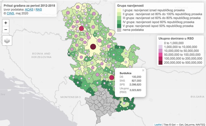
Thematic maps are geographical maps in which spatial data distributions are visualised. Earlier this year I contributed to the CINS’ article about donations to local political parties for the period between 2012-2018. We created an interactive thematic map, choropleth, shading the development group of the town and adding two more layers of information, i.e. attributes: the total amount of money donated (size and the colour of the bubble) and the amount of money received by each of the political parties (popup menu)
🔎Pogledajte odakle dolaze donatori @sns_srbija @socijalisti i @demokrate i ko je prikupio najviše para od donacija u periodu od sedam godina 💸👇https://t.co/2HHXrSLSLC
— CINS (@CINSerbia) May 25, 2020
To create an interactive map like this in R you will need the tmap package. In order to provide the workflow to create thematic maps, additionally you need a set of tools for reading and processing spatial data, available through the tmaptools. I will illustrate how easy it is to create a thematic map using the tmap package, but you can learn more about this package from the tmap: get started! website.
R has impressive geographic capabilities and can handle different kinds of spatial data file formats including geojson and KML. In this example we will make use of the ESRI Shapefile format, which stores non-topological geometry and attribute information for the spatial features in a data set. A shapefile consists minimally of a main file, an index file, and a dBASE table.
- .shp - lists shape and vertices
- .shx - has index with offsets
- .dbf - relationship file between geometry and attributes (data)
To import an ESRI shapefile into R correctly, all three files must be present in the directory and named the same (except for the file extension).
To reproduce this example you will need to download spatial files and data that is visualised on the map. You can download this data bundle from here. These shape files with Serbian districts’ boundaries are obtained from GADM maps and data.
We will start by uploading the required packages and read simple features from our spatial files as indicated in the code below.
## If you don't have ggplot2, dplyr, sf, sp, tm, tmaptools installed yet, uncomment and run the line below
#install.packages("ggplot2", "dplyr", "sf", "sp", "readxl", tm", "tmaptools")
library(ggplot2)
library(dplyr)
library(sf)
library(sp)
library(readxl)
library(tmap)
library(tmaptools)

#pointed to the shape file
serbia_location1 <- "spatial/gadm36_SRB_1.shp"

#used the st_read() function to import it
serbia_districts1 <- st_read(serbia_location1)
The visualisation needs to
- indicate the development group for each Serbian municipality
- display donations to local political parties for the period between 2012-2018 for each municipality
Belgrade city has several municipalities, but donations to local political parties for the period between 2012-2018 is given for the whole of Belgrade. This requires removing the boundary for the whole of the Belgrade district and combining it with the boundaries for the rest of the Serbian municipalities.
In order to filter the necessary geometry for the Belgrade district and to combine it with the sf data for Serbian municipalities we will use tidyverse methods for sf objects. Another issue we need to address is that data also contains information about Kosovo which needs to be included on the map. We will read shape files for Serbian and Kosovo municipalities and combine them into one.
# filter out geometry of Belgrade's district
serbia_districts1 <- serbia_districts1 %>%
  filter(as.character(VARNAME_1) == "Belgrade")


# pointed to the shape files for municipalities (Serbia and Kosovo)
serbia_location <- "gadm36_SRB_2.shp"
kosovo_location <- "gadm36_XKO_2.shp"
#used the st_read() function to import them
serbia_districts <- st_read(serbia_location)
kosovo_districts <- st_read(kosovo_location)

# replace geometries of Belgrade's municipalities with Belgrade district
BG <- serbia_districts %>%
  filter(NAME_2 == "Stari Grad")
BG$NAME_2 <- "Beograd"
BG$NL_NAME_2 <- BG$NL_NAME_1
BG$geometry <- serbia_districts1$geometry

serbia_districts_BG <- serbia_districts %>%
  filter(NAME_1 != "Grad Beograd")

serbia_districts_BG1 <- rbind(BG, serbia_districts_BG)

# combine sf data of serbia and Kosovo
sr <- rbind(serbia_districts_BG1, kosovo_districts)
In the next step we read data to be mapped given in the Excel file and make sure that the names of the municipalities correspond to the names in the sf file in the old fashioned way 😁.
# read excel file
razvijenost <- read_excel("razvijenost.xlsx", sheet = 1)

ki <- serbia_districts$NL_NAME_2[serbia_districts$NAME_2 == "Kikinda"]
gm <- serbia_districts$NL_NAME_2[serbia_districts$NAME_2 == "Gornji Milanovac"]
ar <- serbia_districts$NL_NAME_2[serbia_districts$NAME_2 == "Arilje"]
pe <- serbia_districts$NL_NAME_2[serbia_districts$NAME_2 == "Petrovac"]
dm <- serbia_districts$NL_NAME_2[serbia_districts$NAME_2 == "Dimitrovgrad"]
# ----
pr <- kosovo_districts$NL_NAME_2[kosovo_districts$NAME_2 == "Priština"]
ur <- kosovo_districts$NL_NAME_2[kosovo_districts$NAME_2 == "Uroševac"]

razvijenost$Town[razvijenost$Town == "Кикинда"] <- ki
razvijenost$Town[razvijenost$Town =="Горњи Милановац"] <- gm
razvijenost$Town[razvijenost$Town =="Ариље"] <- ar
razvijenost$Town[razvijenost$Town =="Петровац на Млави"] <- pe
razvijenost$Town[razvijenost$Town =="Димитровград"] <- dm
# ----
razvijenost$Town[razvijenost$Town =="Приштина"] <- pr
razvijenost$Town[razvijenost$Town =="Урошевац"] <- ur

# merge data: sf and excel
my_map <- left_join(sr, razvijenost,
                    by=c("NL_NAME_2" = "Town"))
Once data is organised it can be mapped using tmap. To make it aesthetically more appealing we will rescale the values for total donations so that the bubbles that are going to be used in its visualisation are not too small nor too big. Another matter that needs to be addressed is that the polygon of Negotin’s municipality has an extra border that needs to be removed before we can map data.
# ====================
# ----- Mapping ------

library(tmap)
library(tmaptools)

# scaling `donation`
my_map <- my_map %>%
  mutate(ln_donation = log(donation)^6)

# Pull out the geometry for Negotin
bad_geo  =
  my_map %>%
  filter(NAME_2 == "Negotin") %>%
  pull(geometry)
# Keep only the first of the two polygon borders
good_geo = bad_geo[[1]][1]
# Replace old geometry with fixed
my_map$geometry[which(my_map$NAME_2 == "Negotin")] <- st_multipolygon(good_geo)

# set tmap mode to interactive viewing
tmap_mode(mode =  "view")

# shade municipalities according to the group development and superimpose bubble which size and colour shade correspond to the total level of donation. Enable pop-up information about individual party donations (show it using Latin alphabet rather than Cyrillic).
tm_shape(my_map) +
  tm_polygons("development_group",
              id = "NAME_2",
              palette = "YlGn",
              title = "Grupa razvijenosti",
              textNA = "nema podataka",
              popup.vars=c("DS"="ДС",
                           "SNS"="СНС",
                           "SPS"="СПС",
                           "Ukupno (RSD)" = "donation")) +
  tm_bubbles(size = "ln_donation",
             col = "donation",
             border.col = "black",
             border.alpha = 1,
             style = "fixed",
             breaks=c(0 , 1000000, 10000000, 50000000, 100000000, 200000000, 500000000),
             palette = "PuRd",
             contrast = 1,
             title.col = "Ukupno donirano u RSD",
             id = "NAME_2",
             popup.vars=c("DS"="ДС",
                          "SNS"="СНС",
                          "SPS"="СПС",
                          "Ukupno (RSD)" = "donation")) +
  tm_layout(legend.title.size = .5, legend.text.size = .65,
            legend.frame = TRUE,
            legend.format = list(fun = function(x) {
              formatC(x, digits = 0, big.mark = ",", format = "f")
            })) +
  tm_layout(title = "Prilozi građana za period 2012-2018</b><br>izvor podataka: <a href='http://www.acas.rs/'>ACAS</a> i <a href='ras.gov.rs'>RAS</a><br>© <a href='https://www.cins.rs/'>CINS</a>, maj 2020",
            frame = FALSE,
            inner.margins = c(0.1, 0.1, 0.05, 0.05))
This is information rich visualisation. It incorporates an interactive thematic map, choropleth, shading the development group of the town and adding two more layers of information, i.e. attributes: the total amount of money donated (size and the colour of the bubble) and the amount of money received by each of the political parties (popup menu).
Incorporating interactive visualisation with clearly presented facts, helped to empower readers by informing them in an effective manner.
This was an excellent example of effective data journalism, employed as a direct result of CINS embracing the capacity of the RToolbox.
Tatjana Kecojevic
statistician and ever evolving data scientist
My research work has developed my knowledge and skills within the area of applied statistical modelling. As such, the area of my research enhances the opportunities for cross discipline projects.