Covid UK: How to do it in R
Open data belongs to everyone; it empowers people to make informed decisions that are not clouded by misinformation, rumour and gossip. To be able to identify the underlying facts within data sets, it is crucial that individuals and communities possess the necessary skills. Open data is often inconsistent and limited and requires a significant amount of time to organise and structure for presentation purposes.
This is a data analysis report concerning the visualisation of the COVID-19 virus within the United Kingdom and Europe. All of the report is created with R. It represents a case study as an illustration of the concepts presented at the workshop on basic R for data analysts. To learn how to use R and develop a report like this visit the Introduction To R website.
Covid-19: Open Data
The novel coronavirus disease 2019 (COVID-19) was first reported in Wuhan, China, where the initial wave of intense community transmissions was cut short by interventions.
> # If you don't have the "leaflet" package installed yet, uncomment and run the line below
> #install.packages("leaflet")
> library(leaflet)
> # Initialize and assign as the leaflet object
> leaflet() %>%
+   # add tiles to the leaflet object
+   addTiles() %>%
+   # setting the centre of the map and the zoom level
+   setView(lng = 114.3055, lat = 30.5928 , zoom = 10) %>%
+   # add a popup marker
+ addMarkers(lng = 114.3055, lat = 30.5928, popup = "<b>Wuhan, capital of Central China’s Hubei province</b><br><a href='https://www.ft.com/content/82574e3d-1633-48ad-8afb-71ebb3fe3dee'>China and Covid-19: what went wrong in Wuhan?</a>")- identify the infected and provide treatment
- locate and quarantine all those who had contact with the infected
- sterilise environmental pathogens
- promote the use of masks and social distancing
- release to the public the number of new infections and deaths on a daily basis through open data
The importance of hand washing, wearing a mask and social distancing as a tool to limit disease transmission is well recognised, but nonetheless ensuring social distancing especially in densely populated urban areas is still challenging. Well-educated communities are critical for an effective response and for the prevention of local outbreaks. The sharing of factual information that can be understood and trusted by the communities is vital. This will lead to a change in their behaviour to implement efficiently desired public health actions is a must. Trust and transparency are fundamental in obtaining absolute public engagement. The publishing of daily figures that can be freely analysed and scrutinised can help in engaging communities and obtaining its willing and continued support in controlling the spread of infection.
Working with a DB in R
In big organisations data is often kept in a database and data you wish to access from it might be too large to fit into the memory of your computer. Connecting from R to a database to access the necessary data for an analysis can be very useful, as it allows you to fetch only the chunks needed for the current study. R enables you to access and query a database without having to download the data contained in it. The two most common methods of connection are:
- Option 1)
- the
RODBCpackage: uses slightly older code; it can be used to connect to anything that uses ODBC.
- the
> library("RODBC")
> # Connection with a server called "Walmart" and a database called "Asda":
> RODBC_connection <- odbcDriverConnect('driver = {SQL Server};
+                                       server = Walmart;
+                                       database = Asda;
+                                       trusted_connection = true') #passes your windows credentials to the server; can also specify a username `uid` and a password `pwd`
> dt1 <- sqlFetch(channel = RODBC_connection, sqtable = "MyTable")
Using RODBC you can write back to database tables, choosing to append or not:
> sqlSave(channel = RODBC_connection,
+         dat = dt2,
+         tablename = "MyTable_R_version",
+         append = FALSE,
+         safer = FALSE)
When you finish working using the database you should disconnect from the server.
> odbcClose(RODBC_connection)One of the authors of this package is the famous statistician Brian Ripley, and you can find more about the possibilities it offers by playing around with it using the guidance from RDocumentation on RODBC v1.3-17.
- Option 2)
- the
DBIpackage: a common database interface in R; can be used with different ‘back-end’ drivers such as MySQL, SQL Server, SQLite, Oracle etc; to write SQL it can be used on its own:
- the
> # Can write an SQL query directly using the `dbSendQuery` function
> # Executes the query on the server-side only, but if you want the results back in R, you need to use `dbFetch`
> SomeRecords <- dbFetch(dbSendQuery(DBI_Connection,
+                                    "SELECT CustomerName_column, City_column FROM Customers_Table"))
You can also write back to a database using the dbWriteTable function.
> #Writing a new table called 'Table_created_in_R' using the R data.frame called "my_df", with `append` and `overwrite` options
> dbWriteTable(DBI_Connection,"Table_created_in_R", my_df, overwrite = TRUE)
We use tbl() to define a table as if it were part of the R work-space, and to specify as the function’s arguments the connection object and the name of the table in the database.
> MyTable_Rws <- tbl(DBI_Connection, "MyTable_DB")If we need to pull the data from the server into R’s memory we can use the collect() function.
The DBI package can be combined with:
- the
dplyrpackage: to make thetbls and to work on them usingdplyrsyntax - the
dbplyrpackage: allows translation of SQL to dplyr - the
odbcpackage: provides the odbc drivers, but you could use the functions below with other drivers instead
>     DBI_Connection <- dbConnect(odbc(),
+                                 driver = "SQL Server",
+                                 server = Sys.getenv("SERVER"),
+                                 database = Sys.getenv("DATABASE")
+ )
With the wave of tidy verse evangelists the second option has become more popular as it allows us to convert SQL into R using the dplyr commands chained with the pipe (%>%) operator. dplyr can translate many different query types into SQL. We can use it to do fairly complex queries without translation in just a few lines and obtain the results even though the data is still in the database.
Useful DBI commands
| Command | Summary |
|---|---|
dbConnect() |
Create a DBI connection object |
dbListTables() |
List the tables on the connection |
dbListFields() |
List the fields for a given table on a given connection |
dbSendQuery() |
Send a query to execute on the server/connection |
dbFetch() |
Fetch the results from the server/connection |
dbWriteTable() |
Write a table to the connection |
tbl() |
Set a table on the connection as a tibble for dplyr |
glimpse() |
See a summary of the rows, data types and top rows |
Reading Data
European Centre for Disease Prevention and Control provides daily updates of newly reported cases of COVID-19 by country worldwide. The downloadable data file is updated daily and contains the latest available public data on COVID-19. Each row/entry contains the number of new cases reported per country and per day (with a lag of a day).
https://www.ecdc.europa.eu/en/publications-data/download-data-response-measures-covid-19
https://www.ecdc.europa.eu/en/cases-2019-ncov-eueea
We will start the analysis by uploading the necessary packages and data into R. If you have not got the packages used in the following code, you will need to uncomment the first line (delete the # symbol) in the code below.
> #install.packages(c("dplyr", "stringr")) # install multiple packages by passing a vector of package names to the function; this function will install the requested packages, along with any of their non-optional dependencies
> suppressPackageStartupMessages(library(readxl))
> suppressPackageStartupMessages(library(tidyverse))
> suppressPackageStartupMessages(library(httr))
> suppressPackageStartupMessages(library(lubridate))
> suppressPackageStartupMessages(library(dplyr))
> suppressPackageStartupMessages(library(plotly))
> suppressPackageStartupMessages(library(ggplot2))
> suppressPackageStartupMessages(library(cowplot))
> suppressPackageStartupMessages(library(scales))
> suppressPackageStartupMessages(library(sf))
> suppressPackageStartupMessages(library(DBI))
> suppressPackageStartupMessages(library(dbplyr))
> suppressPackageStartupMessages(library(tmap))
> suppressPackageStartupMessages(library(tmaptools))
>
>
> url2ecdc <- "https://www.ecdc.europa.eu/sites/default/files/documents/COVID-19-geographic-disbtribution-worldwide-2020-11-30.xlsx"
>
> suppressMessages(GET(url2ecdc, write_disk(tf <- tempfile(fileext = ".xlsx"))))
## Response [https://www.ecdc.europa.eu/sites/default/files/documents/COVID-19-geographic-disbtribution-worldwide-2020-11-30.xlsx]
## Date: 2021-02-25 18:24
## Status: 200
## Content-Type: application/vnd.openxmlformats-officedocument.spreadsheetml.sheet
## Size: 3.41 MB
## <ON DISK> /var/folders/71/96w85flx3yl928r2hzpfwvd00000gp/T//RtmpVjACDD/file16166a4a64e4.xlsx> covid_world <- read_excel(tf)We will set up the database connection to work on covid_world data.
> SQLcon <- dbConnect(RSQLite::SQLite(), ":memory:")
> dbWriteTable(SQLcon, "covid", covid_world, overwrite=TRUE)
Let’s see what tables we have in our database.
> dbListTables(SQLcon)## [1] "covid"We can list the fields in a table:
> dbListFields(SQLcon, name = "covid")## [1] "dateRep"
## [2] "day"
## [3] "month"
## [4] "year"
## [5] "cases"
## [6] "deaths"
## [7] "countriesAndTerritories"
## [8] "geoId"
## [9] "countryterritoryCode"
## [10] "popData2019"
## [11] "continentExp"
## [12] "Cumulative_number_for_14_days_of_COVID-19_cases_per_100000"We can run an SQL query directly from R. To illustrate it we will run a query to obtain distinct values for the field “continentExp”.
> dbFetch(dbSendQuery(SQLcon, "Select distinct continentExp from covid"))## continentExp
## 1 Asia
## 2 Europe
## 3 Africa
## 4 America
## 5 Oceania
## 6 OtherNext, we will run a query to count how many entries we have for each continent
> dbFetch(
+   dbSendQuery(SQLcon,
+               "Select continentExp, count(*) as Count
+                  from covid
+                  group by continentExp"))
## continentExp Count
## 1 Africa 14196
## 2 America 13056
## 3 Asia 12653
## 4 Europe 16601
## 5 Oceania 2332
## 6 Other 64and see how many entries there are for the UK, using a where clause.
> dbFetch(
+   dbSendQuery(SQLcon,
+                "Select continentExp, count(*) as Count
+                   from covid
+                   Where countriesAndTerritories = 'United_Kingdom'
+                   group by continentExp"))
## continentExp Count
## 1 Europe 336Fortunately, for people whose SQL is rusty, and who don’t feel like learning both SQL and R, we can do all of this using the diplyr package in R.
First we need to declare covid as a tbl for use with dplyr. We’ll call it covid_ecdc to avoid any confusion.
> covid_ecdc <- tbl(SQLcon, "covid")This will now be treated as an R tibble, but it is still in the database!!!
It is always useful to have a quick glance at the data set structure to find out how the information it contains is structured. Knowledge of the structure is important, because it allows us later to filter out the desired information very precisely, based on criteria to limit specific dimensions, i.e. variables.
> covid_ecdc %>%
+   glimpse()
## Rows: ??
## Columns: 12
## Database: sqlite 3.33.0 [:memory:]
## $ dateRep <dbl> 16066944…
## $ day <dbl> 30, 29, …
## $ month <dbl> 11, 11, …
## $ year <dbl> 2020, 20…
## $ cases <dbl> 0, 228, …
## $ deaths <dbl> 0, 11, 1…
## $ countriesAndTerritories <chr> "Afghani…
## $ geoId <chr> "AF", "A…
## $ countryterritoryCode <chr> "AFG", "…
## $ popData2019 <dbl> 38041757…
## $ continentExp <chr> "Asia", …
## $ `Cumulative_number_for_14_days_of_COVID-19_cases_per_100000` <dbl> 6.416633…Before we go any further and start the analysis of covid data we will replicate the above queries using the dplyr functions. First, to illustrate how easy it is to do the column selection with dplyr we’ll select countriesAndTerritories and continentExpfrom ourcovid_ecdc` data.
> head(covid_ecdc %>%
+        select(countriesAndTerritories, continentExp)) # returns first six rows of the vector, i.e. tibble
## # Source: lazy query [?? x 2]
## # Database: sqlite 3.33.0 [:memory:]
## countriesAndTerritories continentExp
## <chr> <chr>
## 1 Afghanistan Asia
## 2 Afghanistan Asia
## 3 Afghanistan Asia
## 4 Afghanistan Asia
## 5 Afghanistan Asia
## 6 Afghanistan AsiaThe First query was the count of entries for each continent.
> covid_ecdc %>%
+   group_by(continentExp) %>%
+   tally()
## # Source: lazy query [?? x 2]
## # Database: sqlite 3.33.0 [:memory:]
## continentExp n
## <chr> <int>
## 1 Africa 14196
## 2 America 13056
## 3 Asia 12653
## 4 Europe 16601
## 5 Oceania 2332
## 6 Other 64The second was to look for the number of entries for the UK.
> covid_ecdc %>%
+   filter(countriesAndTerritories == "United_Kingdom") %>%
+   tally()
## # Source: lazy query [?? x 1]
## # Database: sqlite 3.33.0 [:memory:]
## n
## <int>
## 1 336If you do not have to manipulate and do the engineering work with DBs, but you need to access it to obtain data for the analysis, you might find it easier to do it all using the dplyr. It is intuitive and therefore easier to write. You cannot deny that dplyr’s version also looks neater.
Next, we’ll check the total number of readings for each country and present it in a table using the DT package. DT provides an R interface to the JavaScript library DataTables, which will enable us to filter through the displayed data.
> if (!require("DT")) install.packages('DT') # returns a logical value say, FALSE if the requested package is not found and TRUE if the package is loaded
> tt <- covid_ecdc %>%
+   group_by(countriesAndTerritories) %>%
+   summarise(no_readings = n()) %>%
+   arrange(no_readings)
>
> mdt <- DT::datatable(data.frame(tt))
> widgetframe::frameWidget(mdt)
Tidying Data
We will focus our analysis on European countries and select them from our covid_world data, saving it all as covid_eu data frame object as this data needs tidying and wrangling and we do not want to limit ourselves by using only dplyr functions in R.
> covid_eu <- rbind(covid_world %>% filter(continentExp == "Europe"),
+                   covid_world %>% filter(countriesAndTerritories == "Turkey"))
>
> mdt <- DT::datatable(covid_eu)
> widgetframe::frameWidget(mdt)dplyr functions do the required manipulations.
> covid_eu <- covid_ecdc %>%
+   filter(continentExp == "Europe") %>%
+   collect()
>
> mdt <- DT::datatable(covid_eu)
> widgetframe::frameWidget(mdt)
The experience with COVID-19 shows that the spread of the disease can be controlled by implementing the measures of prevention as soon as an outbreak has been detected.
To monitor the effectiveness of the measures introduced, we will focus on daily cumulative cases of COVID-19 infection that can be expressed as \[F(x) = \sum_{i=1}^{n} x_i\]
Although \(F(x)\) can show the volume of the epidemic, it does not tell us directly about the changes in the acceleration of the spread of infection. This information can be provided by the derivatives of the \(F(x)\). The first derivative \(F^{’}(x)\) corresponds to the information on the number of new cases detected every day. The second derivative \(F^{’’}(x)\) provides the information about the acceleration of the epidemic. \(F^{’’}(x) \approx 0\) indicates the state of stagnation, while \(F^{’’}(x) < 0\) indicates deceleration and of course any \(F^{’’}(x) > 0\) acceleration.
We will carry on with the analysis by tidying covid_eu data and adding the information about those derivatives. First, we notice that there are 4 columns used to contain the date of reporting, which will allow us to remove columns 2-4 as redundant. We will only keep the dateRep column which requires some tidying up in respect of the format in which the dates are recorded. We will also carry out the necessary calculations for obtaining the second derivative \(F^{’’}(x)\) and rename some of the variables to make them easier to display and type. 😁 All of this is very easy to carry out in R using the tidy verse, opinionated collection of R packages for data science.
> # --- tidy data ---
> glimpse(covid_eu)
## Rows: 16,863
## Columns: 12
## $ dateRep <dttm> 2020-11…
## $ day <dbl> 30, 29, …
## $ month <dbl> 11, 11, …
## $ year <dbl> 2020, 20…
## $ cases <dbl> 835, 545…
## $ deaths <dbl> 11, 16, …
## $ countriesAndTerritories <chr> "Albania…
## $ geoId <chr> "AL", "A…
## $ countryterritoryCode <chr> "ALB", "…
## $ popData2019 <dbl> 2862427,…
## $ continentExp <chr> "Europe"…
## $ `Cumulative_number_for_14_days_of_COVID-19_cases_per_100000` <dbl> 342.1921…> #covid_eu <- covid_eu[, -c(2:4)] # remove redundant information
> covid_eu <- covid_eu %>%
+ separate(dateRep, c("dateRep"), sep = "T") %>%
+ group_by(countriesAndTerritories) %>%
+ arrange(dateRep) %>%
+ mutate(total_cases = cumsum(cases),
+ total_deaths = cumsum(deaths)) %>%
+ mutate(Diff_cases = total_cases - lag(total_cases), # 1st derivative (same as cases)
+ Rate_pc_cases = round(Diff_cases/lag(total_cases) * 100, 2)) %>% # rate of change
+ mutate(second_der = Diff_cases - lag(Diff_cases)) %>% # 2nd derivative
+ rename(country = countriesAndTerritories) %>%
+ rename(country_code = countryterritoryCode) %>%
+ rename(Fx14dper100K = "Cumulative_number_for_14_days_of_COVID-19_cases_per_100000") %>%
+ mutate(Fx14dper100K = round(Fx14dper100K))
>
> covid_eu$dateRep <- as.Date(covid_eu$dateRep)
> head(covid_eu) # returns first six rows of the df## # A tibble: 6 x 17
## # Groups: country [6]
## dateRep day month year cases deaths country geoId country_code
## <date> <dbl> <dbl> <dbl> <dbl> <dbl> <chr> <chr> <chr>
## 1 2019-12-31 31 12 2019 0 0 Armenia AM ARM
## 2 2019-12-31 31 12 2019 0 0 Austria AT AUT
## 3 2019-12-31 31 12 2019 0 0 Azerba… AZ AZE
## 4 2019-12-31 31 12 2019 0 0 Belarus BY BLR
## 5 2019-12-31 31 12 2019 0 0 Belgium BE BEL
## 6 2019-12-31 31 12 2019 0 0 Croatia HR HRV
## # … with 8 more variables: popData2019 <dbl>, continentExp <chr>,
## # Fx14dper100K <dbl>, total_cases <dbl>, total_deaths <dbl>,
## # Diff_cases <dbl>, Rate_pc_cases <dbl>, second_der <dbl>Writing Functions
As we would like to be able to plot this time series of the second derivatives \(F^{’’}(x)\) for any country, we will create functions that will allow us to extract a country from the covid_eu data and to plot it as a time series.
> # function for filltering a country from the given df
> sep_country <- function(df, ccode){
+   df_c <- df %>%
+     filter(country_code == as.character(ccode))
+   return(df_c)
+ }
>
> # plotting the 2nd derivative
> sec_der_plot <- function(df){
+   df %>%
+   filter(!is.na(second_der)) %>%
+     ggplot(aes(x = dateRep, y = second_der)) +
+     geom_line() + geom_point(col = "#00688B") +
+     xlab("") + ylab("") +
+     labs (title = "2nd derivative of F(x)",
+           caption = "Data from: https://www.ecdc.europa.eu") +
+     theme_minimal() +
+     theme(plot.title = element_text(size = 14, vjust = 2, hjust=0.5),
+           panel.grid.major.x = element_blank(),
+           panel.grid.minor.x = element_blank())
+ }
Data Visualisation
Once we have accessed and tidied up our data in R we can carry out the exploitative analysis using visualisation as an effective tool.
plotly and ggplot
We will start reporting by illustrating the time series of the daily number of new cases of infection and deaths. To make this plot more informative, we will create it as an interactive web graphic using the plotly library. You can explore different kinds of plotly graphs in R from https://plotly.com/r/basic-charts/ or by reading the Step-by-Step Data Visualization Guideline with Plotly in R blog post.
ecdc data updated on 2020-11-30
> # Plot cases and deaths day-by-day
>
> covid_uk <- sep_country(covid_eu, "GBR")
>
> x <- list(title = "date reported")
>
> fig <- plot_ly(covid_uk, x = ~  dateRep)
> fig <- fig %>% add_trace(y = ~cases, name = 'cases', type = 'scatter', mode = 'lines')
> fig <- fig %>% add_trace(y = ~deaths, name = 'deaths', type = 'scatter', mode = 'lines')
> fig <- fig %>% layout(xaxis = x)
> figThe plots below illustrate dynamic changes based on the \(F(x)\) created using the ggplot2 package. What we would like to see is the flattening of the bars indicating the slowdown in the number of new Covid-19 cases.
> covid_uk %>%
+   ggplot(aes(x = dateRep, y = total_cases)) +
+   geom_bar(stat="identity", fill = "#00688B") +
+   labs (title = "Cumulative number of cases F(x)",
+         caption = "Data from: https://www.ecdc.europa.eu",
+         x = "Date", y = "number of cases") +
+   theme_minimal() +
+   theme(plot.title = element_text(size = 14, vjust = 2, hjust=0.5),
+         panel.grid.major.x = element_blank(),
+         panel.grid.minor.x = element_blank()) +
+ theme(legend.position="none") 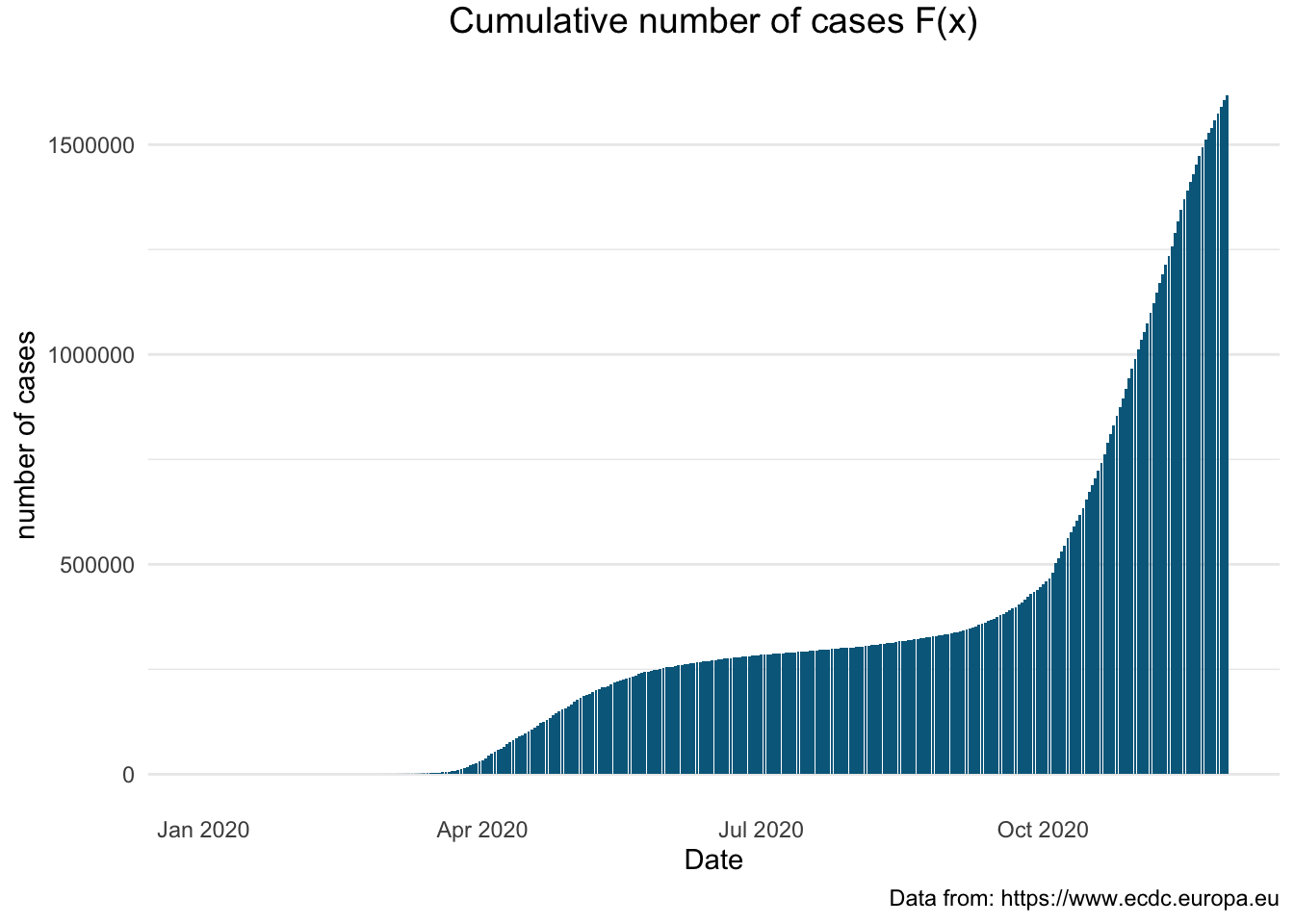
We will present the same information this time using the line plot integrating interactivity, displaying the information by using the ggplotly() function.
> pl1 <- covid_uk %>%
+   ggplot(aes(x = dateRep, y = total_cases)) +
+   geom_line() + geom_point(col = "#00688B") +
+   xlab("Date") + ylab("Number of Cases") +
+   labs (title = "F(x)",
+         caption = "Data from: https://www.ecdc.europa.eu") +
+   theme_minimal() +
+   theme(plot.title = element_text(size = 14, vjust = 2, hjust=0.5),
+         panel.grid.major.x = element_blank(),
+         panel.grid.minor.x = element_blank())
> pl1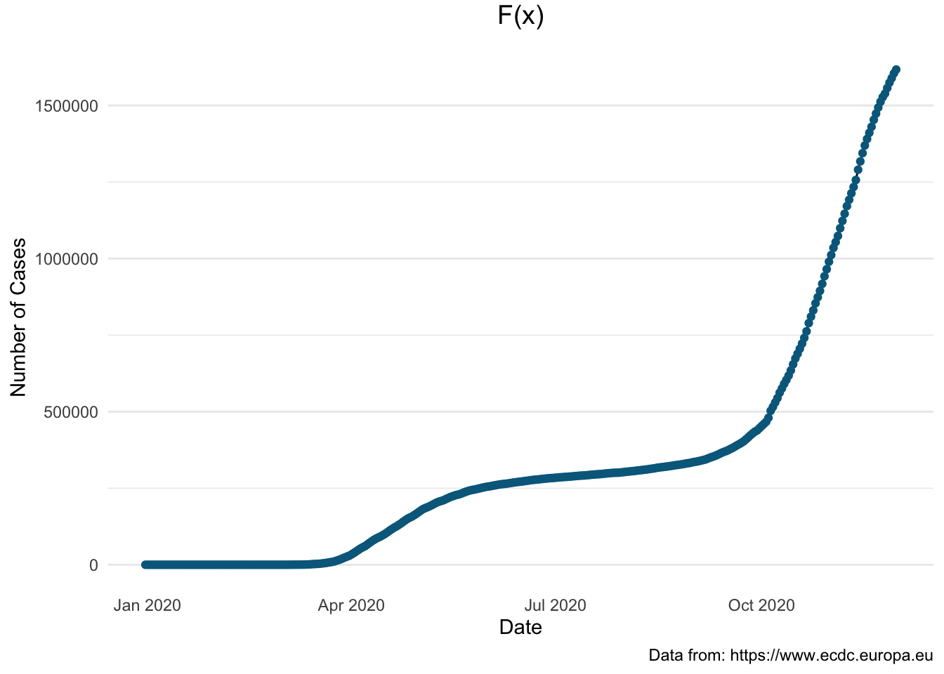
The following graph presents the cumulative number of covid-19 cases using a logarithmic scale to emphasise the rate of change in a way that a linear scale does not.
> pl_log <- covid_uk %>%
+   mutate(log_total_cases = log(total_cases)) %>%
+   ggplot(aes(x = dateRep, y = log_total_cases)) +
+   geom_line() + geom_point(col = "#00688B") +
+   xlab("") + ylab("") +
+   labs (title = "F(x) on log scale",
+         caption = "Data from: https://www.ecdc.europa.eu") +
+   theme_minimal() +
+   theme(plot.title = element_text(size = 14, vjust = 2, hjust=0.5),
+         panel.grid.major.x = element_blank(),
+         panel.grid.minor.x = element_blank())
> pl_log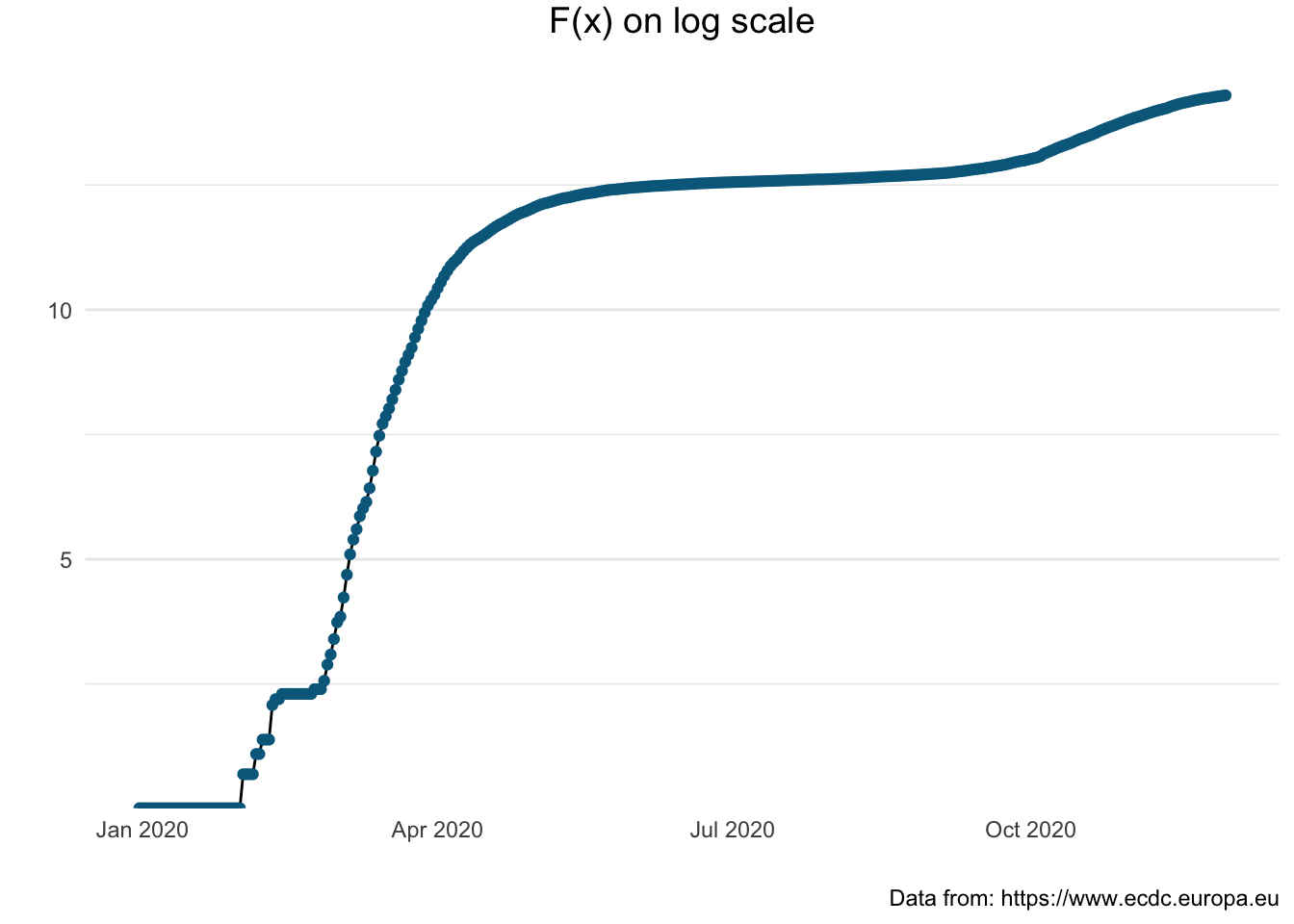
Sometimes it might be useful to present several plots next to each other. To do this in R we apply the plot_grid() function from the cowplot package.
> plot_grid(pl1, pl_log)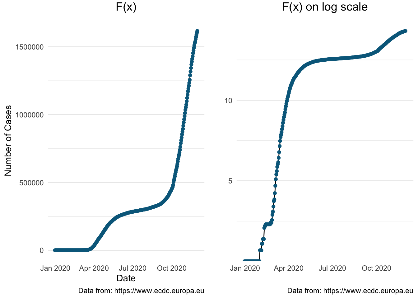 Next we will illustrate the cumulative number of cases for all selected European countries
> all_plot <- covid_eu %>%
+   filter(country_code %in% c("GBR", "FRA", "DEU", "ITA", "ESP", "SWE")) %>%
+   filter(dateRep > (max(dateRep) - 21)) %>%
+   ggplot(aes(x = dateRep, y = total_cases, colour = country_code)) +
+   geom_line() +
+   xlab("") + ylab("") +
+   labs (title = "F(x) in the last three weeks",
+         caption = "Data from: https://www.ecdc.europa.eu") +
+   theme_minimal() +
+   theme(plot.title = element_text(size = 14, vjust = 2, hjust=0.5),
+         panel.grid.major.x = element_blank(),
+         panel.grid.minor.x = element_blank()) +
+   scale_x_date(labels = date_format("%m-%d"),
+                breaks = 'day') +
+   scale_colour_brewer(palette = "Set1") +
+   theme_classic() +
+   theme(legend.position = "bottom") +
+   theme(axis.text.x = element_text(angle = 90))
> ggplotly(all_plot)Again, this would be easier to compare using the log scale
> covid_eu %>%
+ filter(country_code %in% c("GBR", "FRA", "DEU", "ITA", "ESP", "SWE")) %>%
+ filter(dateRep > (max(dateRep) - 21)) %>%
+ mutate(log_total_cases = log(total_cases)) %>%
+ ggplot(aes(x = dateRep, y = log_total_cases, colour = country_code)) +
+ geom_line() +
+ xlab("") + ylab("") +
+ labs (title = "logF(x) in the last three weeks",
+ caption = "Data from: https://www.ecdc.europa.eu") +
+ theme_minimal() +
+ theme(plot.title = element_text(size = 14, vjust = 2, hjust=0.5),
+ panel.grid.major.x = element_blank(),
+ panel.grid.minor.x = element_blank()) +
+ scale_x_date(labels = date_format("%m-%d"),
+ breaks = 'day') +
+ scale_colour_brewer(palette = "Set1") +
+ theme_classic() +
+ theme(legend.position = "bottom") +
+ theme(axis.text.x = element_text(angle = 45)) 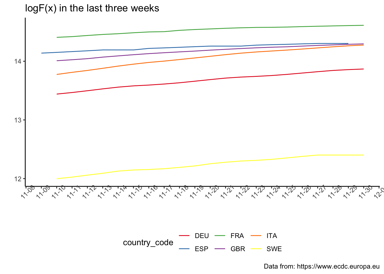 The following plot enables us to observe the change in the acceleration in relation to the governmental measures.
> covid_uk %>%
+   filter(!is.na(second_der)) %>%
+   ggplot(aes(x = dateRep, y = second_der)) +
+   geom_line() + geom_point(col = "#00688B") +
+   xlab("") + ylab("") +
+   labs (title = "2nd derivative of F(x) for the UK",
+         caption = "Data from: https://www.ecdc.europa.eu") +
+   theme_minimal() +
+   theme(plot.title = element_text(size = 14, vjust = 2, hjust=0.5),
+         panel.grid.major.x = element_blank(),
+         panel.grid.minor.x = element_blank()) +
+   geom_vline(xintercept = as.numeric(as.Date("2020-03-23")), linetype = 3, colour = "red", alpha = 0.5) +
+   geom_vline(xintercept = as.numeric(as.Date("2020-05-10")), linetype = 3, colour = "dodgerblue4", alpha = 0.5) +
+   geom_vline(xintercept = as.numeric(as.Date("2020-07-04")), linetype = 3, colour = "chartreuse4", alpha = 0.5) +
+   geom_vline(xintercept = as.numeric(as.Date("2020-11-05")), linetype = 3, colour = "red", alpha = 0.5) +
+   annotate(geom="text", x=as.Date("2020-03-23"), y = 8000,
+            label="UK wide lockdown", col = "red") +
+   annotate(geom="text", x=as.Date("2020-05-21"), y = 5000,
+            label="lockdown lifting plan", col = "dodgerblue4") +
+   annotate(geom="text", x=as.Date("2020-07-04"), y = -5000,
+            label="wide-ranging changes" , col = "chartreuse4") +
+   annotate(geom="text", x=as.Date("2020-11-05"), y = 8000,
+ label="UK wide lockdown", col = "red") 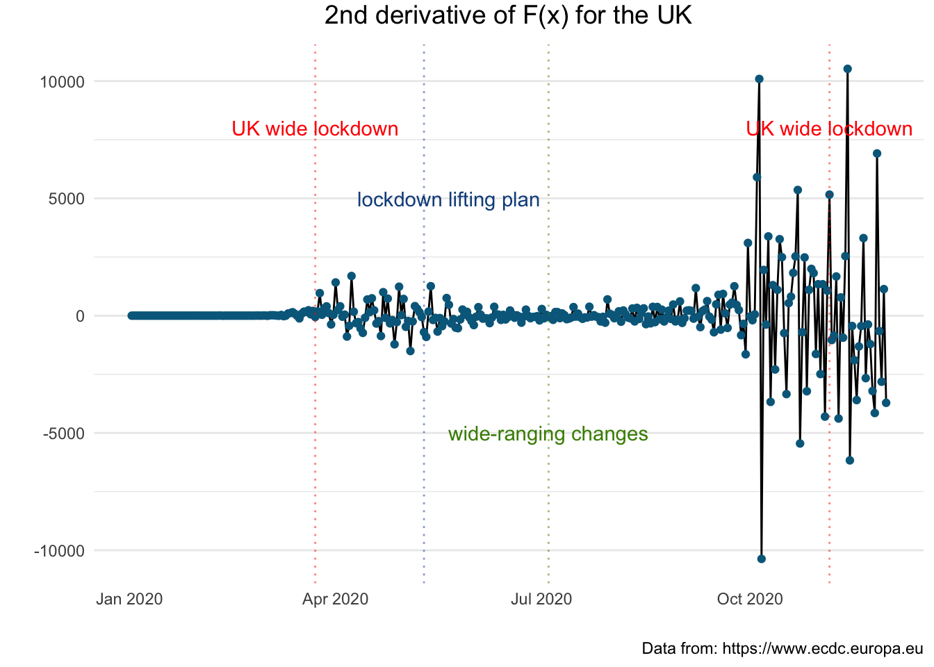
Let us see how these figures compare with other countries in particular France and Germany.
France: \(F^{''}(x)\)
> covid_fr <- sep_country(covid_eu, "FRA")
> sec_der_plot(covid_fr)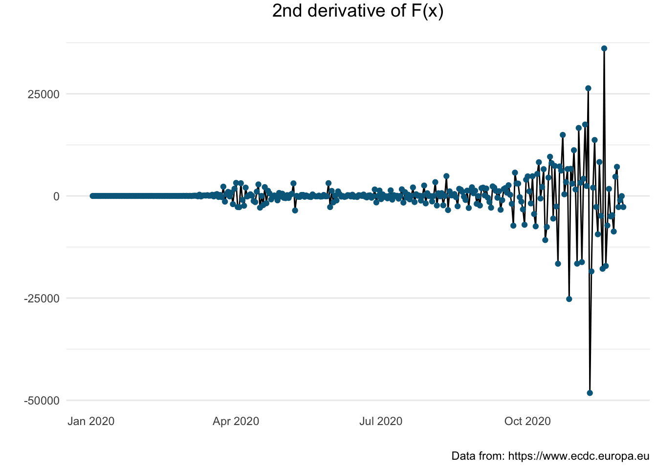
Germany: \(F^{''}(x)\)
> covid_de <- sep_country(covid_eu, "DEU")
> sec_der_plot(covid_de)
Next, we are going to visualise a comparison between these three countries of the total number of deaths month by month.
> covid_eu %>%
+    filter(country %in% c("United_Kingdom", "Germany", "France")) %>%
+    mutate(mon = month(dateRep, label = TRUE, abbr = TRUE)) %>%
+    group_by(country, mon) %>%
+    summarise(no_readings = n(), tdeath = max(total_deaths)) %>%
+    ggplot(aes(x = mon, y = tdeath, fill = country)) +
+    geom_bar(stat="identity", position = "dodge", color = "black") +
+    theme(plot.title = element_text(size = 14, vjust = 2, hjust=0.5)) +
+    labs (title = "total number of deaths by month",
+          caption = "Data from: https://www.ecdc.europa.eu/en",
+          x = "month", y = "number of deaths") +
+    scale_fill_brewer(palette="Paired") +
+ theme(legend.position="bottom") 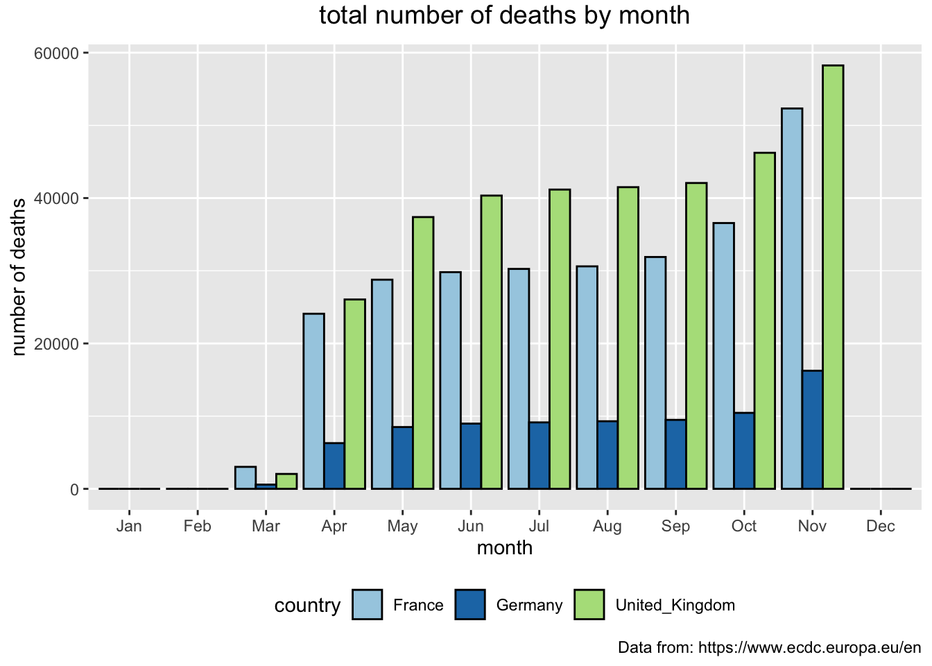
We can make the same kind of comparisons for the total number of infections. But, before we just copy/paste and make an adjustment for y access, note that the order of the months does not show in the timeline of covid events. The recording of information about the spread of the pandemic started last December, which means that the bars should be in order from December to November. We are also going to flip the bars to see if it will add to its readability.
> covid_eu %>%
+    filter(country %in% c("United_Kingdom", "Germany", "France")) %>%
+    mutate(mon = month(dateRep, label = TRUE, abbr = TRUE)) %>%
+    mutate(mon = factor(mon, levels=c("Dec", "Jan", "Feb", "Mar", "Apr", "May", "Jun", "Jul", "Aug", "Sep", "Oct", "Nov"))) %>%
+    group_by(country, mon) %>%
+    summarise(no_readings = n(), tcases = max(total_cases)) %>%
+    ggplot(aes(x = mon, y = tcases, fill = country)) +
+    geom_bar(stat="identity", position = "dodge", color = "black") +
+    coord_flip() +
+    theme(plot.title = element_text(size = 14, vjust = 2, hjust=0.5)) +
+    labs (title = "total number of infections by month",
+          caption = "Data from: https://www.ecdc.europa.eu/en",
+          x = "month", y = "number of infections") +
+    scale_fill_brewer(palette="Set1") +
+ theme(legend.position="bottom") 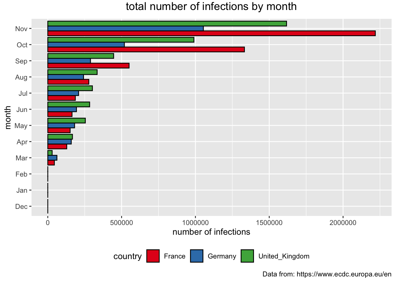
We can present the total number of infections for each month. As the numbers are high we are going to “control” the way the values on the y access are going to appear.
> covid_eu %>%
+    filter(country %in% c("United_Kingdom", "Germany", "France")) %>%
+    mutate(mon = month(dateRep, label = TRUE, abbr = TRUE)) %>%
+    mutate(mon = factor(mon, levels=c("Dec", "Jan", "Feb", "Mar", "Apr", "May", "Jun", "Jul", "Aug", "Sep", "Oct", "Nov"))) %>%
+    group_by(country, mon) %>%
+    summarise(month_cases = sum(cases)) %>%
+    ggplot(aes(x = mon, y = month_cases, fill = country)) +
+    geom_bar(stat="identity", position = "dodge", color = "black") +
+    theme(plot.title = element_text(size = 14, vjust = 2, hjust=0.5)) +
+    scale_y_continuous(breaks = seq(0, 800000, 200000), labels = c("0", "200K", "400K", "600K", "800K")) +
+    labs (title = "total number of infections each month",
+          caption = "Data from: https://www.ecdc.europa.eu/en",
+          x = "month", y = "number of deaths") +
+    scale_fill_brewer(palette="Dark2") +
+ theme(legend.position="bottom") 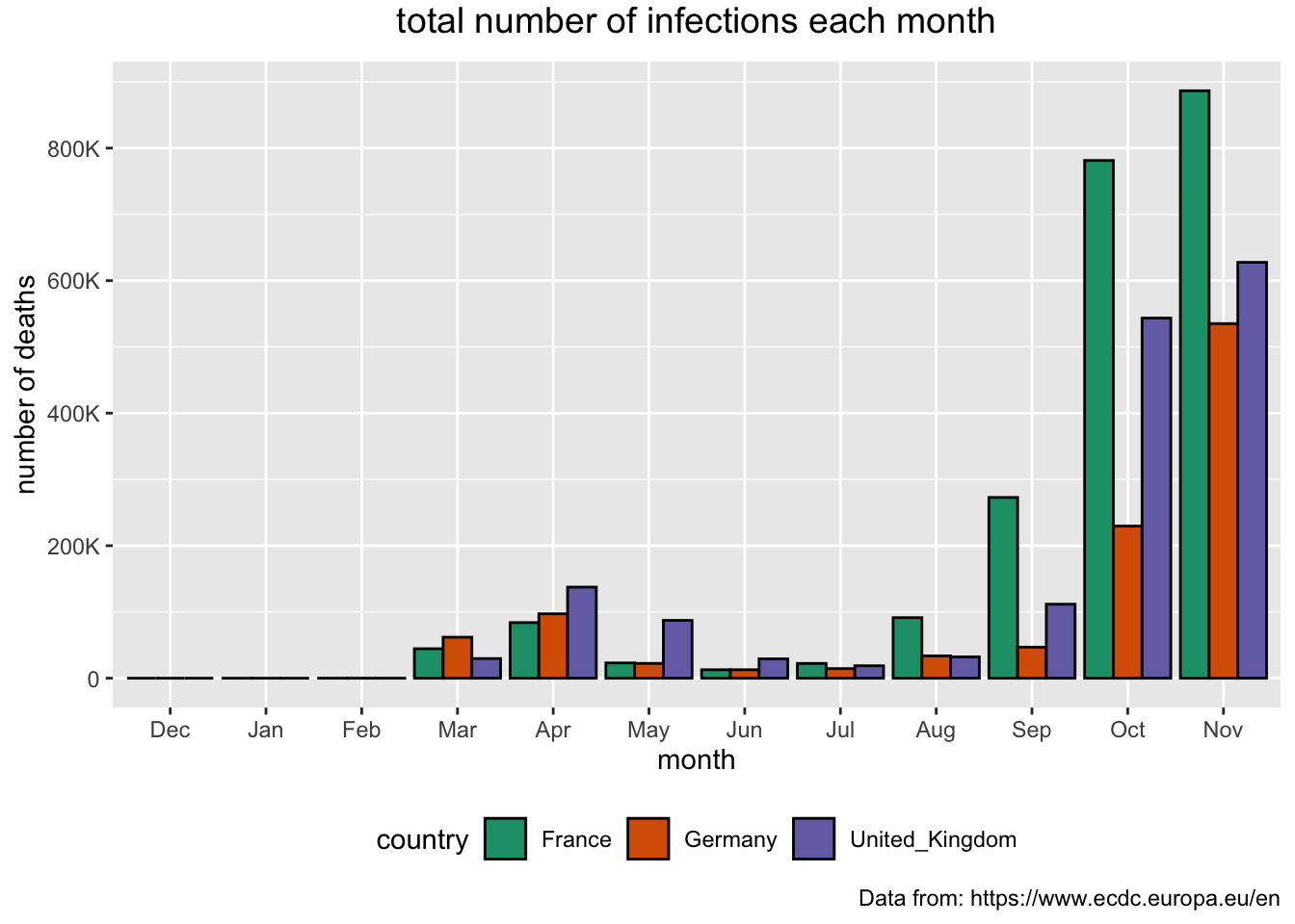
Next, we are going to present the total number of deaths for each of the months since the recording began. Note, that in the code there is a line that is currently set as a comment that allows for the values to appear as texts on the top of the bars. You can go ahead and uncomment this line by removing the hashtag symbol in front of it.
> covid_eu %>%
+    filter(country %in% c("United_Kingdom", "Germany", "France")) %>%
+    mutate(mon = month(dateRep, label = TRUE, abbr = TRUE)) %>%
+    mutate(mon = factor(mon, levels=c("Dec", "Jan", "Feb", "Mar", "Apr", "May", "Jun", "Jul", "Aug", "Sep", "Oct", "Nov"))) %>%
+    group_by(country, mon) %>%
+    summarise(month_deaths = sum(deaths)) %>%
+    ggplot(aes(x = mon, y = month_deaths, fill = country)) +
+    geom_bar(stat="identity", position = "dodge", color = "black") +
+    theme(plot.title = element_text(size = 14, vjust = 2, hjust=0.5)) +
+ #   geom_text(aes(label = month_cases), size = 3, hjust = 0.5) +
+    labs (title = "total number of deaths each month",
+          caption = "Data from: https://www.ecdc.europa.eu/en",
+          x = "month", y = "number of cases") +
+    scale_fill_brewer(palette="Accent") +
+ theme(legend.position="bottom") 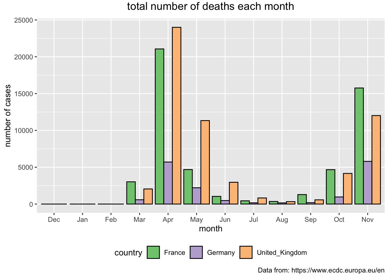
Spatial Visualisation
We will create a choropleth in which we will colour the EU countries according to the most current value of cumulative numbers for 14 days of COVID-19 cases per 100000. To do this we will use the shape file onto which we will superimpose this value as a colour of the polygon, i.e. country.
> #points to the shape file
> bound <- "shapes/eu_countries_simplified.shp"
>
> #used the st_read() function to import it
> bound <- st_read(bound)
## Reading layer `eu_countries_simplified' from data source `/Users/Tanja1/Documents/My_R/mws/content/post/Covid_UK/shapes/eu_countries_simplified.shp' using driver `ESRI Shapefile'
## replacing null geometries with empty geometries
## Simple feature collection with 54 features and 4 fields (with 4 geometries empty)
## geometry type: GEOMETRY
## dimension: XY
## bbox: xmin: -10.48 ymin: 34.5675 xmax: 44.81861 ymax: 71.13312
## CRS: 4326> # plot the shape file
> ggplot(bound) +
+ geom_sf()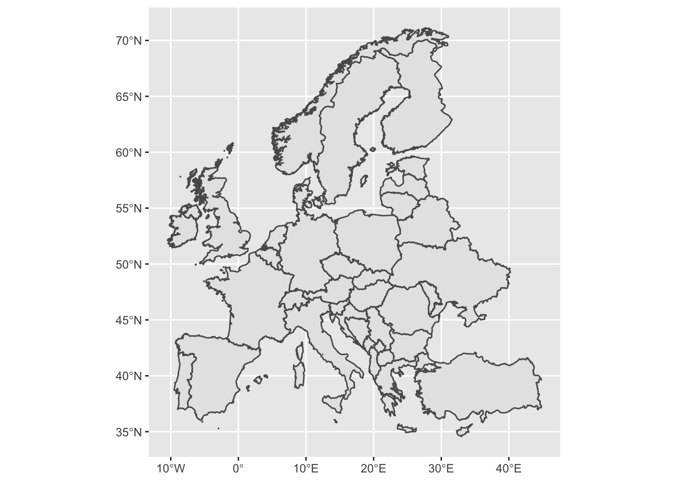
> covid_EU <- covid_eu %>%
+   filter(dateRep == max(dateRep))
>
>
> # tidy up
> # make the country names correspond to ecdc data
> bound$country <- gsub(" ", "_", bound$country)
> bound <- bound %>%
+   mutate(country = fct_recode(country,
+                               "Czechia" = "Czech_Republic",
+                               "North_Macedonia" = "Macedonia"))
>
> # join data from the two data frames
> my_map <- left_join(bound, covid_EU,
+                     by = c("country" = "country"))
>
> ggplot(my_map) +
+   geom_sf(aes(fill = Fx14dper100K)) +
+   scale_fill_distiller(direction = 1, name = "Fx14per100K") +
+   labs(title="Cumulative number for 14 days of COVID-19 cases per 100000", caption="Source: ecdc")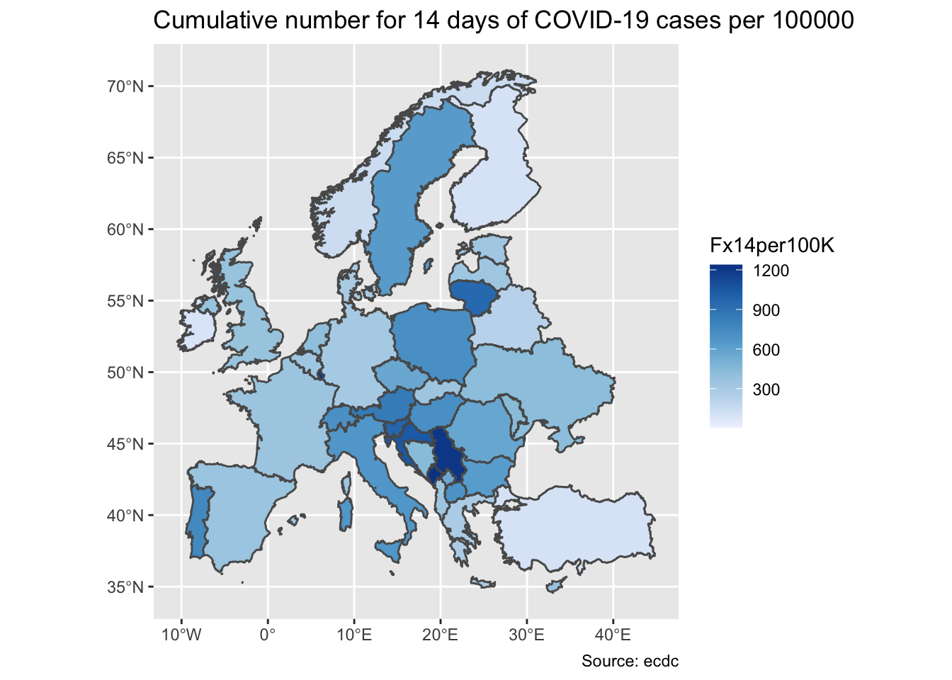
> mdt <- DT::datatable(my_map)
> widgetframe::frameWidget(mdt)
With the tmap package, thematic maps can be generated with great effectiveness presenting several layers of information. The syntax is similar to the one adopted in ggplot. Motivation and the explanation of this package has been proposed and published in the article tmap: Thematic Maps in R.
If you are interested in learning more about creating maps in R check the online version of the book Geocomputation with R. Chapter 8: The Making maps with R provides an easy to follow overview on using the tmap and other packages for creating beautiful maps in R.
> my_map <- my_map %>%
+ mutate(ln_deaths = log(deaths)^10)
>
> #tmap_mode(mode = "view")
>
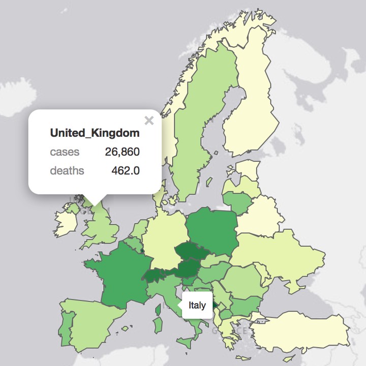
> tm_shape(my_map) +
+ tm_polygons("Fx14dper100K",
+ id = "country",
+ palette = "YlGn",
+ popup.vars=c("cases",
+ "deaths")) +
+ tm_layout(title = "Covid-19 EU</b><br>data source: <a href='https://www.ecdc.europa.eu/en/covid-19-pandemic'>ECDC</a>",
+ frame = FALSE,
+ inner.margins = c(0.1, 0.1, 0.05, 0.05)) Lastly, we should not forget to disconnect from the database.
dbDisconnect(SQLcon)Useful Links
Working with a DB in R section is an adaptation of the NHS-R Community Database Connections in R webinar created and run by Chris Mainey.
Tatjana Kecojevic
statistician and ever evolving data scientist
My research work has developed my knowledge and skills within the area of applied statistical modelling. As such, the area of my research enhances the opportunities for cross discipline projects.